Large empty walls are one of the most common design problems in modern homes. Here’s the framework for solving them — and the specific approaches that actually work.
A large empty wall is one of the most common design frustrations in a home. It’s too big for a single standard-sized print. A gallery wall feels like a hedge. And everything you put on it looks like you put it there to fill a gap rather than because it belongs.
Here’s the framework for solving the large wall problem properly — and the specific approaches that work at different budgets and aesthetics.
Why Large Walls Are Hard
The problem with most approaches to large walls is scale. A standard print or canvas (24×36, the most common residential art size) that looks commanding in a small room disappears on a large wall. The visual math is simple: a piece that occupies less than one-third of the wall’s width looks like it’s floating rather than anchoring.
The second problem is treatment — choosing something because it fills the space rather than because it belongs in the space. The result is art that solves an architectural problem but doesn’t add anything to the room’s character.
The approach that works: choose first for the room’s aesthetic and emotional tone, then ensure the scale is appropriate, rather than doing it the other way around.
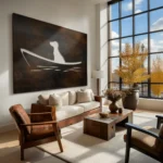
Approach 1: One Large Statement Piece
This is the most effective approach for most large walls, and the one most people underinvest in because of scale anxiety. A single piece at the right scale — commanding, not competing with anything else on the wall — is the most resolved solution.
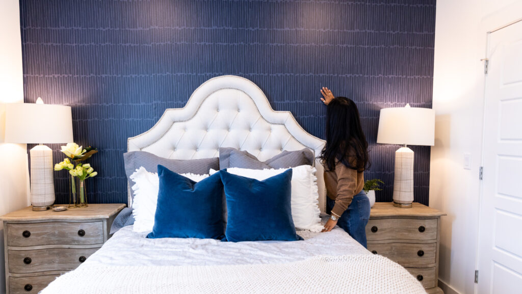
For a wall 8–10 feet wide, the art should be at minimum 54–66 inches wide. For a wall 10–14 feet wide, think 72 inches and above.
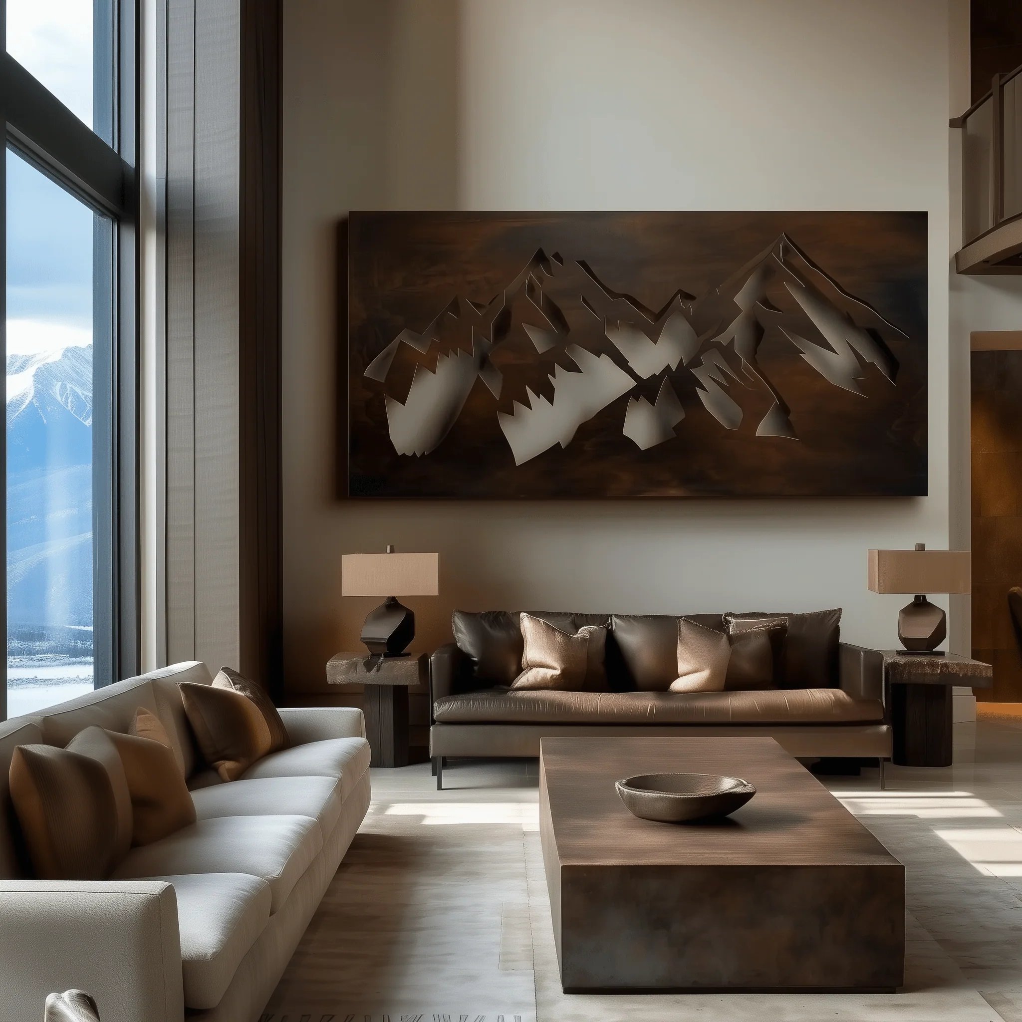
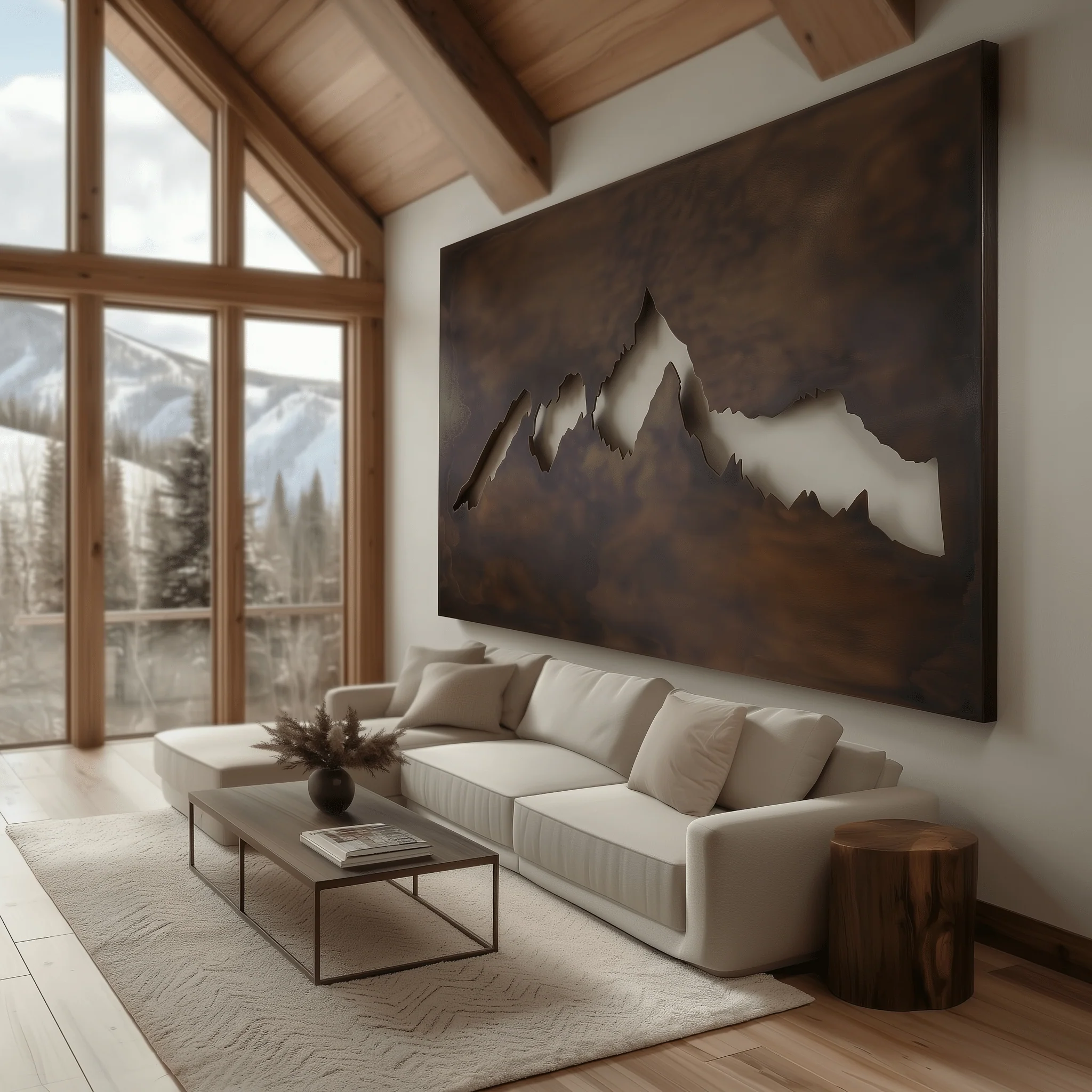
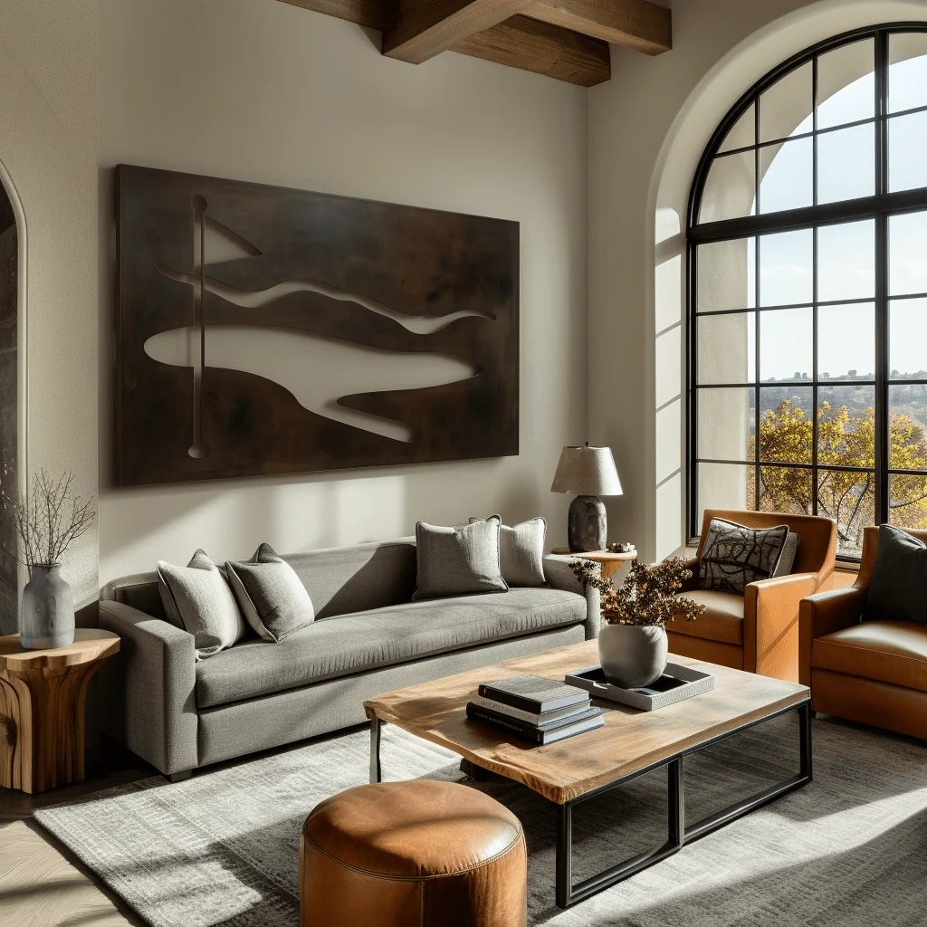
Anthem Classic’s metal wall art is one of the strongest options at this scale. Hand-welded from solid 14-gauge American steel and finished with a warm Umber patina, these pieces are made to order in the Ozarks and available in large landscape formats specifically suited to commanding walls.
The Grand Teton — a wide horizontal mountain range composition — is designed for the exact problem a large wall presents. At its larger sizes it spans 60+ inches and immediately becomes the room’s focal point rather than an afterthought on the wall.
The Crestfall — more dramatic and angular — works particularly well on dark walls or in rooms where the rest of the decor is warm and layered.
The Fairway — wider and more fluid — is a strong option for living rooms with a calm, coastal, or minimal-organic aesthetic.
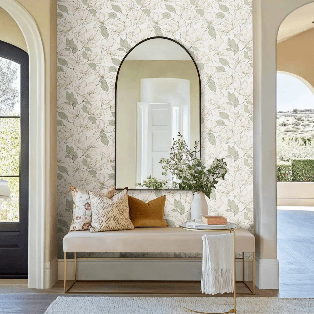
Approach 2: Wallpaper the Wall
For rooms where art alone isn’t solving the problem, wallpapering the large wall entirely is frequently the better answer. It transforms the wall’s character rather than treating it as a surface to hang things on.
For a large feature wall, the paper needs to be confident — either a large-scale pattern, a dramatic botanical, or a bold color on a dark ground.
Painted Paper’s Odette Arboretum (metallic botanical on black) is one of the most effective options for this treatment. The scale of the botanical illustration fills a large wall without becoming repetitive, and the dark ground creates depth rather than the flatness of paint.
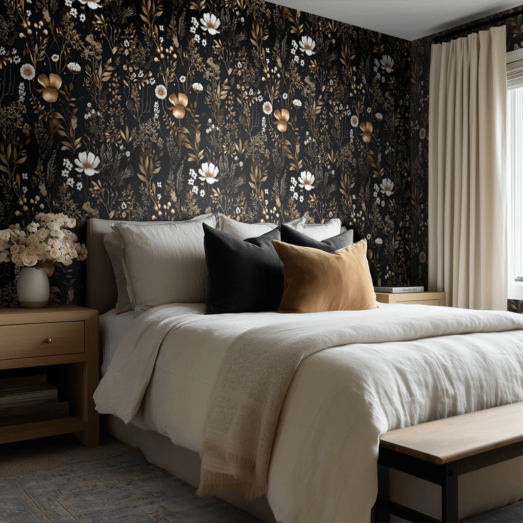
For a richer, more romantic treatment, the Rosalind Floral Wallpaper (layered florals in deep, muted tones) creates a moody, garden-at-dusk effect on a large wall that feels both dramatic and intentional—bringing a sense of depth and old-world sophistication that reads as thoughtfully designed.
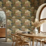
Lemon Park Tangled Wallpaper An intricate weave of soft pink and green florals creates a layered, almost sketch-like pattern that feels organic and slightly whimsical. In a powder room or small sitting space, this paper adds movement and charm—the kind of design that feels collected and a little unexpected, bringing a fresh, garden-inspired energy without reading overly traditional. 
Approach 3: Wallpaper Plus Art
The combination of a wallpapered wall and one strong piece of art on top of it is one of the most considered solutions for a large wall — and one of the rarest, which makes it one of the most distinctive.
The key: the art and wallpaper need to be complementary without being matchy. A dimensional metal piece — Anthem’s The Crestfall or The Fairway — mounted against a botanical wallpaper in a warm neutral ground creates a layered, collected effect that reads as though the room was designed by someone who knew exactly what they were doing.
The art provides depth against the flat pattern. The pattern gives the wall a ground that prevents the art from floating. The combination solves the large wall problem completely.
Approach 4: Gallery Wall (Done Right)
If a gallery arrangement is the direction, the rules that make it work are simple and worth following strictly.
Choose a dominant piece — at least 24×36 — and build outward from it. Everything else in the arrangement should feel related to that anchor, not like a separate collection on the same wall.
Use consistent framing. Mixed frame finishes that are all different sizes in different proportions are the most common gallery wall mistake. Choose one frame finish and stick to it. The variation comes from the art, not the frames.
Keep the outer edges of the arrangement within a rectangle proportional to the wall — roughly two-thirds the wall’s width, two-thirds the wall’s height. This creates visual structure.
Leave at least three inches between pieces. The negative space between pieces is as important as the pieces themselves.