The dining room is built for drama. Here’s why bold wallpaper is the right move — and the specific patterns that work best in the room where you spend the most intentional time.
More than any other room, the dining room earns bold wallpaper. You’re seated in it. You’re looking at the walls from close range, for extended periods, in candlelight. The scale is usually intimate. And it’s the room guests remember most specifically — the room they mention when they tell someone about your home.
Most people play it safe in the dining room. A warm neutral, maybe an accent wall. The rooms that get talked about are the ones that committed.

Why the Dining Room Specifically
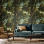
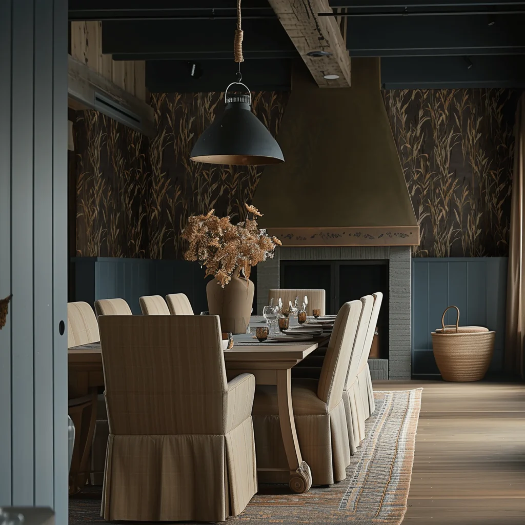
The logic for bold wallpaper in the dining room is more compelling than in any other space. You spend meaningful time there in the evening — the time when deep colors and dramatic patterns look their best, when candlelight plays across the surface of a textured paper in ways that daylight can’t produce. You’re looking at the walls at close range, which means the detail in a complex pattern actually gets seen. And the room is typically small enough that full coverage — all four walls, ceiling included — is achievable with three to four rolls. The rooms that consistently appear in shelter magazines and design features are the jewel box dining rooms: deep botanical on black, rich burgundy damask, forest green with botanical detail. The cost to achieve this is lower than most people expect, and the impact is higher than almost any other single room investment.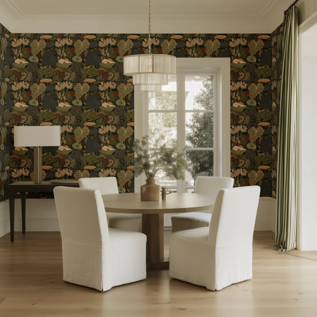
Riverbank by Painted Paper
→ Painted Paper Riverbank Wallpaper
What Makes Dining Room Wallpaper Work
The ground color matters most in dining rooms. Dark grounds — black, deep navy, forest green, rich wine — absorb and deepen candlelight. They make the room feel intimate at dinner and sophisticated in daylight. Light grounds create a different quality — airier, fresher, more breakfast-room than dinner-party-room. The pattern should reward close inspection. You’re sitting at a table looking at these walls. A pattern with genuine detail and complexity — illustrated botanicals, layered textures, intricate repeats — creates the sense that every inch of the room was considered. Ceiling treatment elevates the effect dramatically. Taking the wallpaper up onto the ceiling, and centering a pendant fixture within the pattern, creates an enveloped quality that no amount of paint can achieve.The Best Patterns for Dining Rooms
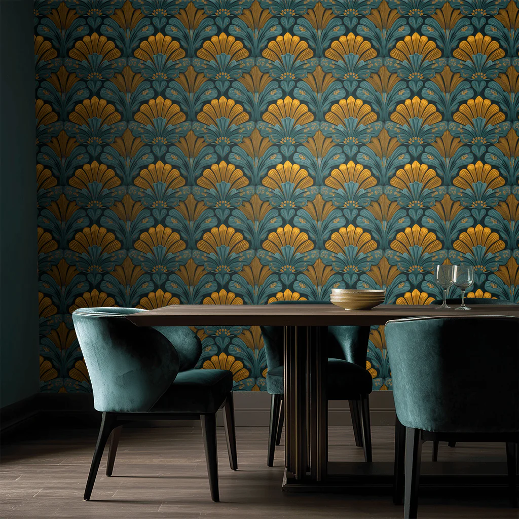
Painted Paper: Amberhall Bloom makes the case for going all in better than almost any paper on this list — the teal and gold fan motifs fill a dining room wall with the kind of saturated, pattern-on-pattern richness that makes guests stop talking when they walk in. It’s the paper equivalent of committing to a statement: dark enough to feel dramatic, warm enough to feel inviting, and confident enough that the room essentially styles itself around it.
Amberhall bloom by Painted Paper
→ Painted Paper Amberhall Bloom Wallpaper
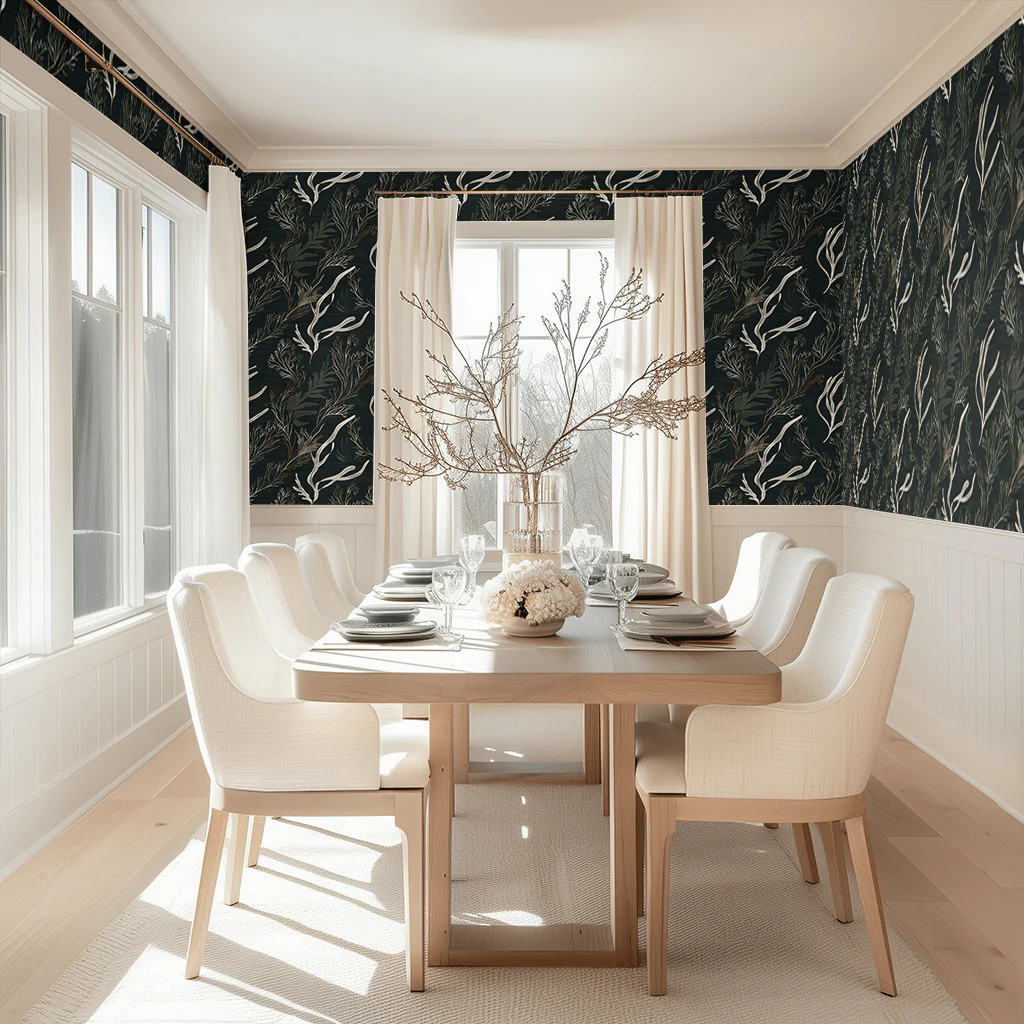
Painted Paper: Kelp Forest Is a dense, dark botanical pattern drenches a dining room in depth and atmosphere without making it feel closed in, which is the hardest thing for a bold wallpaper to pull off. Where most dark dining room papers demand you commit to a moody, low-light room, this one holds its own even in a room flooded with natural light — which means you get the drama without sacrificing the space.
Kelp Forest by Painted Paper
→ Painted Paper Kelp Forest Wallpaper
Painted Paper: Natural State brings exactly the kind of considered darkness that separates a bold dining room from a merely painted one — the golden grasses glow against the near-black ground like something lit from within, which means the room only gets better as the evening light drops. It’s the rare paper that looks more at home with a long dinner table and low pendant lighting than it does in daylight, which is precisely the quality a dining room wallpaper should have.
Natural State by Painted Paper
→ Painted Paper Natural State Wallpaper
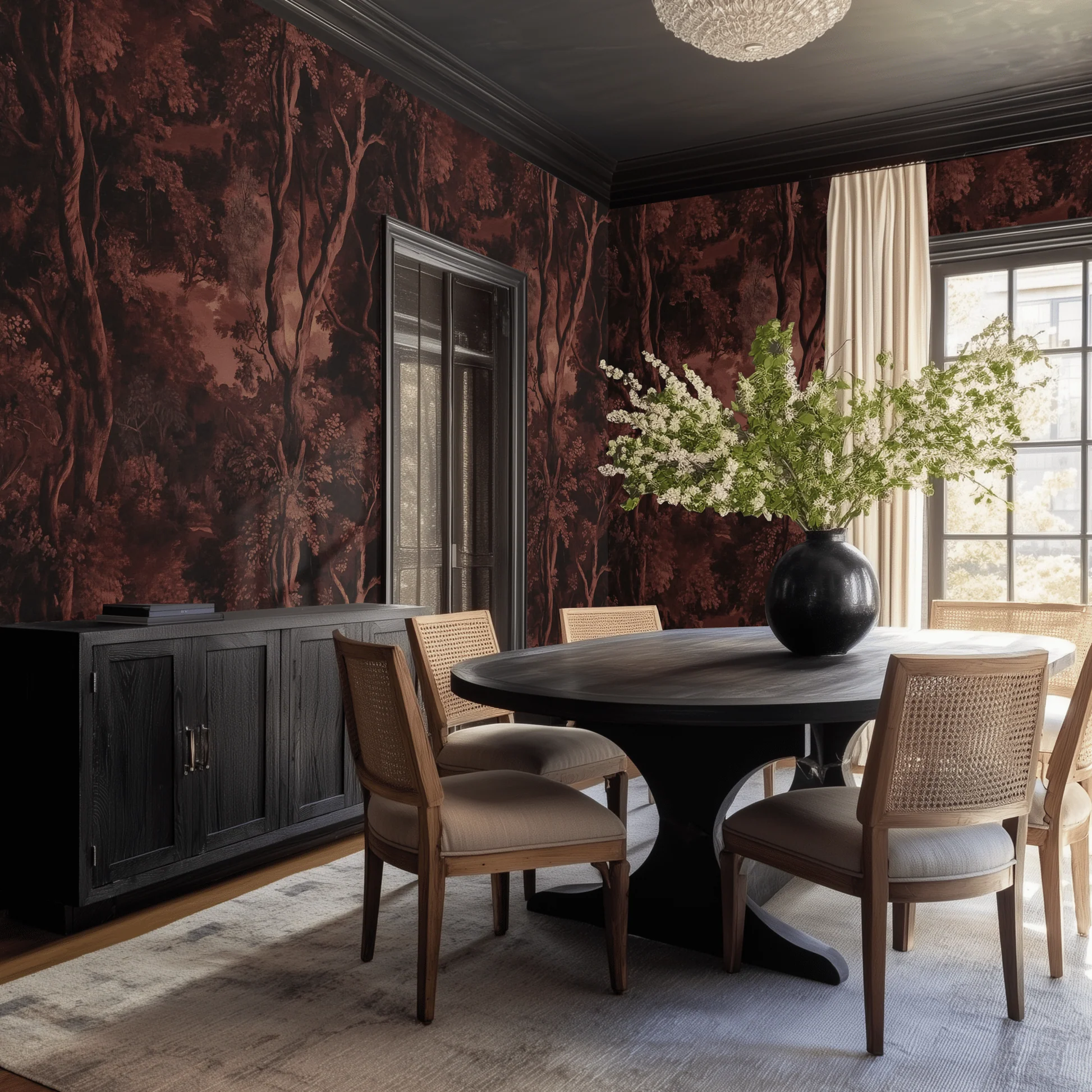
Painted Paper: Nerissa does what the best dining room wallpapers do — it makes the room feel like a destination rather than a place you pass through, with its deep burgundy woodland wrapping all four walls and the ceiling in a single immersive scene. The pattern is detailed enough to reward a long dinner at the table but dark enough that the room only gets better when the lights dim and the candles go up.
Nerissa by Painted Paper
→ Painted Paper Nerissa Wallpaper
Completing the Dining Room
Wallpaper establishes the room’s character. The lighting and furniture complete it. Lighting is non-negotiable: a pendant or chandelier on a dimmer, candles on the table, and a secondary warm light source (sconces, sideboard lamp). The room should be designed for how it looks at eight in the evening, not two in the afternoon. For the wall with the most presence — typically the wall facing the entry or opposite the window — consider adding a single large piece of dimensional art on top of the wallpaper. Anthem Classic’s The Grand Teton or The Crestfall against a dark botanical ground creates a layered, gallery-quality effect. The dimensional metal against the flat pattern provides material contrast and focal depth.→ Anthem The Grand Teton Metal Wall Art
→ Anthem The Crestfall Metal Wall Art
→ Full Painted Paper Collection