Unexpected pairings can bring a room to life. These seven color combinations prove that a little contrast—and a bit of bravery—can create spaces that feel balanced, fresh, and surprisingly timeless.
For the most part, there are key design rules that make sense to follow. However, sometimes breaking the rules pays off in unexpected ways. That’s certainly true for these surprising color combinations that shouldn’t look good together, but somehow manage to dazzle. They may defy color theory, but these palettes simply work and deserve your consideration. From dark and moody to soft and sophisticated, there’s an out-of-the-box color palette for every decor style.
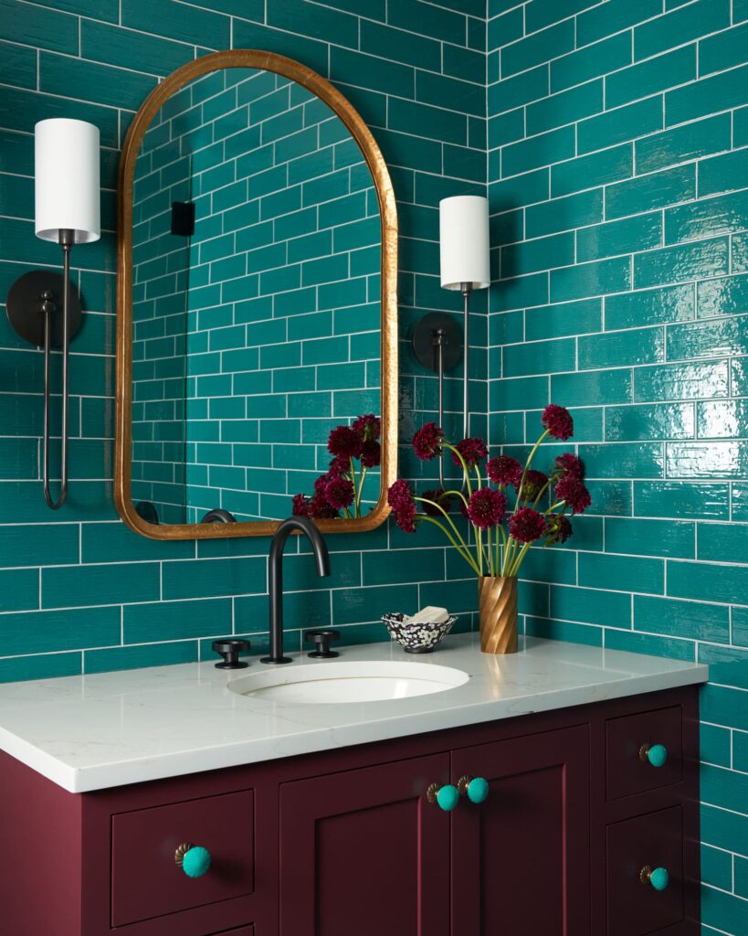
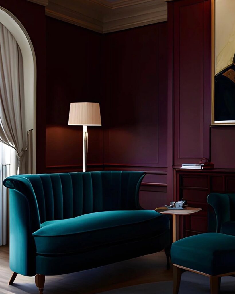
1. Teal & Oxblood
Especially when paired with brass finishings, teal and oxblood give off a moody air that finds harmony between classic and bohemian. The best way to pull off this palette is to pick one color as the hero hue while the other can take a supporting role. For example, if you prefer teal, then a teal sofa paired with oxblood pillows is a stellar way to approach this color scheme.
Michelle Gage Interiors
Smith Honig
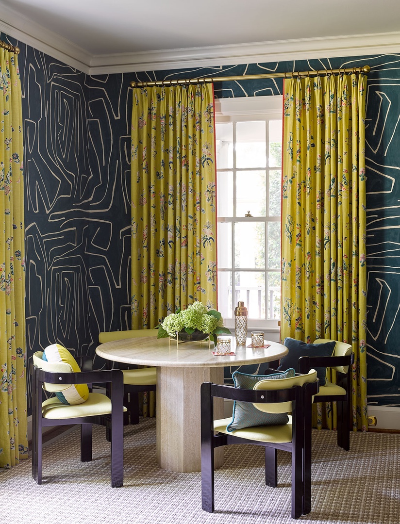
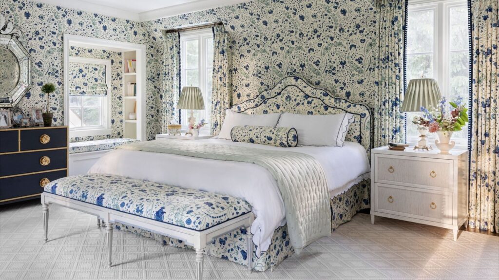
2. Chartreuse & Indigo
Chartreuse is one of those colors that can look awful, but that’s often a result of not knowing how to deftly work with it. When styled alongside the right hues, the color will look striking rather than sickly. The depth and vividness of indigo anchors the combination, while chartreuse brings a unique brightness to balance things out. In a living room, you could pair a chartreuse sofa with bold indigo throw pillows. In an office, indigo lamps would work nicely alongside a chartreuse accent wall. For a bedroom, consider color-drenching the space in indigo and accessorizing with chartreuse curtains.
Charlotte Lucas Design
Charlotte Lucas Design
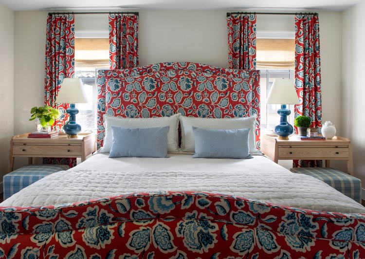
3. Red & Pale Blue
While traditional red and blue often resemble Fourth of July party decor, when pale blue is substituted in place of royal blue, you’re left with a sophisticated palette that is a refined take on the Americana aesthetic. Try pairing powder blue walls with vibrant red accessories. Alternatively, you can accessorize an exposed brick wall with curated pale blue accents for a rugged take on the scheme.
Nadia Watts
Emily Thurman Design // Austin Leis
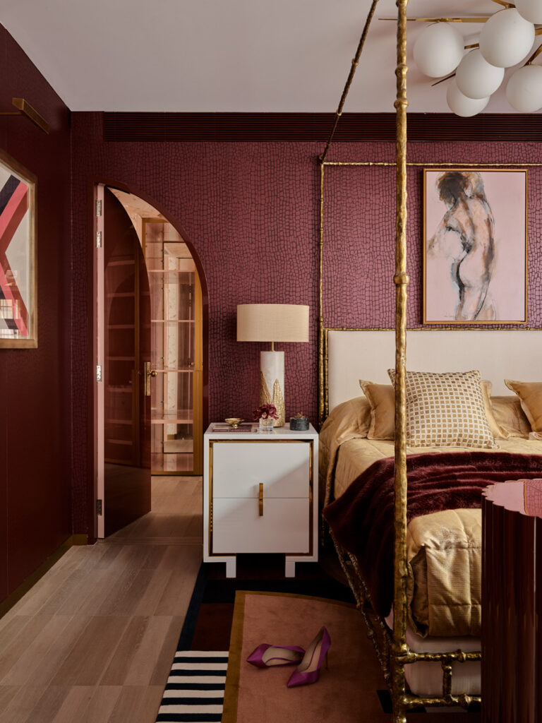
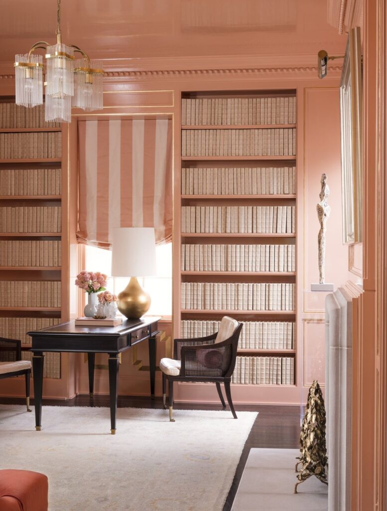
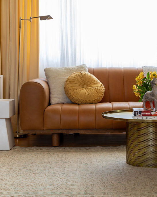
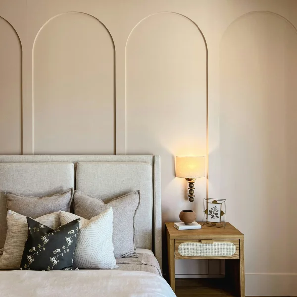
4. Merlot & Camel
Merlot and camel is a refined take on the regal, luxurious pairing of purple and gold. We love this pairing because of how effortlessly camel adds warmth to the depth of Merlot. Wondering how to make this look your own? Paint Merlot onto an accent wall and style the vignette with a leather chair in a scrumptious shade of camel for a cozy, but not dowdy, result.
Mary Patton
Greg Natale
5. Olive & Dusty Pink
On the search for a combo that feels earthy and floral at the same time? While brighter shades of green and pink may read as preppy, you can achieve a sophisticated and feminine take on these colors by pairing olive green with dusty pink. Plus, these colors are proof that you can achieve a bold, curated look without overly saturated colors. In a kitchen, consider olive cabinets with a pink backsplash. Meanwhile, for a living room, pair pink accent chairs with olive green walls for a space that feels positively European.
Cynthia Rojas of Minty Synth Interiors
Visual Comfort
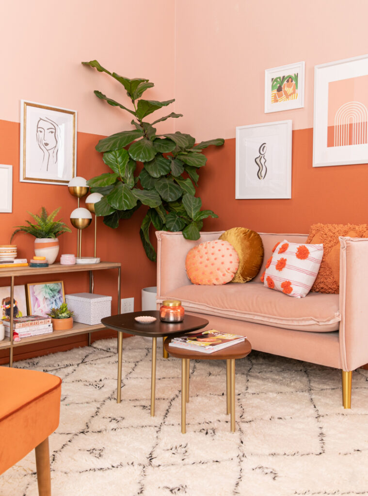
6. Rust & Salmon
Brown and pink as a pair aren’t anything new, but there is a simple way to achieve a fresh, reimagined version of the color palette. Shift chocolate brown into the more coppery realm of rust. At the same time, shift pink toward a more orange-tinted salmon variety. The end result is a daring, dramatic color palette that’s warm and modern. While some color palettes might feel overpowered if one hue is favored too heavily, a nice thing about rust and salmon are how evenly matched they are. The color scheme looks just as nice with a 50/50 split as it does with one of the hues taking the lead.
Oh Joy // Lily Glass
Melanie Turner Interiors // Mali Azima
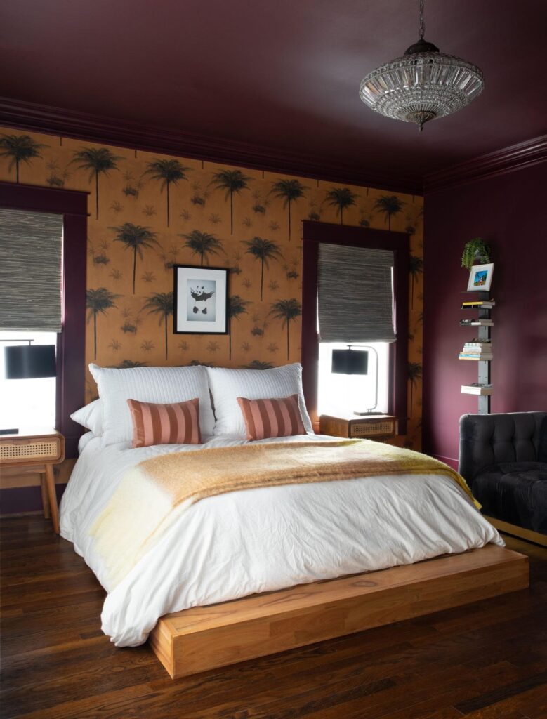
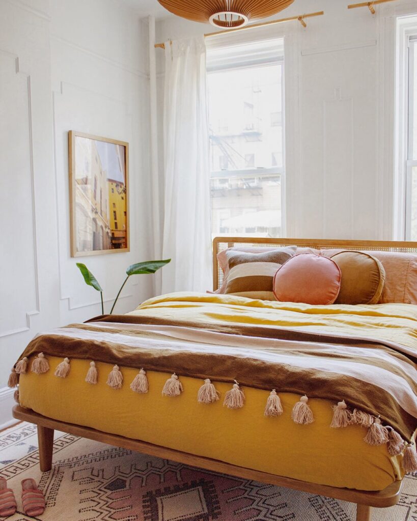
7. Cognac & Mustard
While many color palettes rely on pairing contrasting colors, this warm combo is a unique take on a tone-on-tone scheme. Mustard yellow and ambery cognac are rich and stately while still feeling welcoming. Given the innate coziness of this color palette, it’s a solid choice for bedroom decor. A mustard-hued duvet accented with cognac throw pillows or bedside lamps is a great approach. Another place to try the color palette? In a sun room. Bring in earthenware planters, a mustard settee or ottoman, and a smattering of rattan accessories for an outdoorsy interpretation of the scheme.